New visualization helps to better understand Spark Streaming applications
Previously, we demonstrated the new visualization feature in Spark1.4.0 ("Spark 1.4 : SparkR Release, Tungsten Wire Project ") to better understand the behavior of Spark applications .
Then this topic, this blog will focus on understanding the Spark
Streaming application to introduce the new visualization capabilities. We have updated the Streaming tab in the Spark UI to display the following information:
Let's take a look at some of the new features above by analyzing the example of a Streaming application from start to finish.
Timeline and Histogram to Handle Trends When we debug a Spark Streaming application, we would like to see how the data is being received at what rate and how often each batch is processed. The new UI in the Streaming tab allows you to easily see the current value and the trend of the previous 1000 batches. When you run a Streaming application, if you go to the Streaming tab in the Spark UI, you will see something like the following figure (red letters, such as [A], are our comments, Not a part of the UI).

Figure 1: Streaming tab in the Spark UI
The first line (labeled [A]) shows the current state of the Streaming application; in this example, the application has run for nearly 40 minutes at a batch interval of 1 second; below it is the input rate The timeline (labeled [B]) shows the Streaming application receiving data from its source at about 49 events per second. In this example, the timeline shows a significant decrease in the average rate at the middle position (labeled [C]), and the application is resumed at the end of the timeline. If you want more detailed information, you can click the drop-down list next to Input Rate (near [B]) to display the respective timeline for each source, as shown in Figure 2 below:

figure 2
Figure 2 shows that this application has two sources, (SocketReceiver-0 and SocketReceiver-1), one of which leads to a decline in the overall rate of reception, because it is in the process of receiving data for a period of time.
This page is displayed again downwards (marked as [D] in Figure 1), processing time (Processing Time), these batches are processed in about 20 milliseconds, and the batch interval (in this example (Which is 1s) compared to the less processing time, which means that the scheduling delay (defined as: a batch waiting before the batch processing is completed, marked as [E]) is almost zero because these batches are When the creation has been dealt with. Scheduling delays are the key to the stability of your Streaming reference program, and the new functionality of the UI makes it easier to monitor it.
Batch Details Again, with reference to Figure 1, you may be curious about why some of the batches of the right take longer to complete (note the [F] in Figure 1). You can easily analyze the reason through the UI. First of all, you can click on the timeline view of the batch processing time is relatively long point, which will be in the bottom of the page to produce a complete list of details on the completion of the batch.

Streaming RDDs' directed acyclic execution diagram Once you start analyzing the stages and tasks generated by the batch job, it is useful to have a deeper understanding of the execution diagram. As mentioned in the previous blog post, Spark1.4.0 joined the visualization of the directed execution (DAG), which shows the RDD dependency chain and how to handle RDD and a series of related Of the stages. If in a Streaming application, these RDDs are generated through DStreams, then visualization will show additional Streaming semantics. Let's start with a simple streaming word count program, and we will count the number of words received for each batch. Program example NetworkWordCount. It uses the DStream operations flatMap, map, and reduceByKey to count the number of words. The directed acyclic execution of a Spark job in any batch will be shown in Figure 5 below.

Future Directions An important boost in Spark1.5.0 is more information about entering data in each batch (JIRA, PR). For example: If you are using Kafka, the batch details page will show this batch of topics, partitions and offsets, as shown in the following figure:

Source: New visualization helps to better understand Spark Streaming applications
- Timeline view and event rate statistics, scheduling delay statistics, and previous batch time statistics
- Details of all JOBs in each batch
Let's take a look at some of the new features above by analyzing the example of a Streaming application from start to finish.
Timeline and Histogram to Handle Trends When we debug a Spark Streaming application, we would like to see how the data is being received at what rate and how often each batch is processed. The new UI in the Streaming tab allows you to easily see the current value and the trend of the previous 1000 batches. When you run a Streaming application, if you go to the Streaming tab in the Spark UI, you will see something like the following figure (red letters, such as [A], are our comments, Not a part of the UI).
Figure 1: Streaming tab in the Spark UI
The first line (labeled [A]) shows the current state of the Streaming application; in this example, the application has run for nearly 40 minutes at a batch interval of 1 second; below it is the input rate The timeline (labeled [B]) shows the Streaming application receiving data from its source at about 49 events per second. In this example, the timeline shows a significant decrease in the average rate at the middle position (labeled [C]), and the application is resumed at the end of the timeline. If you want more detailed information, you can click the drop-down list next to Input Rate (near [B]) to display the respective timeline for each source, as shown in Figure 2 below:
figure 2
Figure 2 shows that this application has two sources, (SocketReceiver-0 and SocketReceiver-1), one of which leads to a decline in the overall rate of reception, because it is in the process of receiving data for a period of time.
This page is displayed again downwards (marked as [D] in Figure 1), processing time (Processing Time), these batches are processed in about 20 milliseconds, and the batch interval (in this example (Which is 1s) compared to the less processing time, which means that the scheduling delay (defined as: a batch waiting before the batch processing is completed, marked as [E]) is almost zero because these batches are When the creation has been dealt with. Scheduling delays are the key to the stability of your Streaming reference program, and the new functionality of the UI makes it easier to monitor it.
Batch Details Again, with reference to Figure 1, you may be curious about why some of the batches of the right take longer to complete (note the [F] in Figure 1). You can easily analyze the reason through the UI. First of all, you can click on the timeline view of the batch processing time is relatively long point, which will be in the bottom of the page to produce a complete list of details on the completion of the batch.
image 3
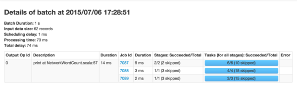
It will display all the main information for this batch (highlighted in green in Figure 3 above). As you can see, this batch has a longer processing time than the other batches. Another obvious question is: which spark job in the end is caused by the batch processing time is too long.
You can click on Batch Time (the blue link in the first column), which
will show you the details of the corresponding batch, showing you the
output operations and their spark job, as shown in Figure 4.
Figure 4
Figure 4 shows an output operation that produces three spark jobs. You can click on the job ID link to go deep into the stages and tasks to do more in-depth analysis. Streaming RDDs' directed acyclic execution diagram Once you start analyzing the stages and tasks generated by the batch job, it is useful to have a deeper understanding of the execution diagram. As mentioned in the previous blog post, Spark1.4.0 joined the visualization of the directed execution (DAG), which shows the RDD dependency chain and how to handle RDD and a series of related Of the stages. If in a Streaming application, these RDDs are generated through DStreams, then visualization will show additional Streaming semantics. Let's start with a simple streaming word count program, and we will count the number of words received for each batch. Program example NetworkWordCount. It uses the DStream operations flatMap, map, and reduceByKey to count the number of words. The directed acyclic execution of a Spark job in any batch will be shown in Figure 5 below.
Figure 5
The black dot in the visual display represents the RDD generated by the DStream at 16:06:50 in the batch.
The blue shaded square refers to the DStream operation used to convert
RDD, and the pink box represents the stage in which these conversion
operations are performed. In summary, Figure 5 shows the following information: - The data is received at a batch time 16:06:50 through a socket text stream.
- Job uses two stages and flatMap, map, reduceByKey conversion operations to calculate the number of words in the data
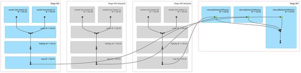
Figure 6
Figure 6 shows a lot of relevant information about a Spark job across three batches of statistics: - The first three stages are actually the number of words in three batches of the respective statistics window. This is a bit like the first example of NetworkWordCount's example above, using map and flatmap operations. But be aware of the following differences:
- There are two input RDDs, respectively, from two socket text streams, which are combined into a RDD by union, and then further converted to produce intermediate statistics for each batch.
- The two stages are grayed out because the intermediate results of the two older batches have been cached in memory, so there is no need to recalculate only the most recent batches that need to be calculated from scratch.
- The last one on the right uses the reduceByKeyAndWindow to combine the number of counts of each batch to eventually form a "window" of the word count.
Future Directions An important boost in Spark1.5.0 is more information about entering data in each batch (JIRA, PR). For example: If you are using Kafka, the batch details page will show this batch of topics, partitions and offsets, as shown in the following figure:
Source: New visualization helps to better understand Spark Streaming applications


Commentaires
Enregistrer un commentaire